Helping musicians communicate
Planning Center is a scheduling app for musicians. It helps them stay on the same page when coordinating events.
The Problem
Musicians are struggling with basic communication on the app. There is no way to send the whole team a message about a schedule. Moreover, the team is not notified when there are changes in the schedule.
As a result, musicians are resorting to texting and other messaging apps to organize events rather than using Planning Center.
The Solution
A comment section was added to the event page that allows users to communicate, with posts being contained and organized under specific events.
In addition, users now have the option to send group messages. Any comments or changes on an event will be reflected in the notifications section as well.
Eventually, a streamlined chat function can be added that users can trust and use for communication.
My Role
I conducted all user research, including interviews, surveys and competitive analyses.
I created wireframes and prototypes specifically targeting the communication issues, as well as run through usability tests.

Design Process
Research Insights
I interviewed musicians who actively utilize this app for scheduling as well as reference some public reviews for the app. These were the focus points during the research phase:
Major pain points throughout the user journey
What musicians really want and need from a scheduling app
I have personally used this app before and I was expecting to hear feedback about how unintuitive the process of adding a set list was (because that was my struggle), but I was surprised to find an overwhelming amount of pain points on the issue of communication.
There is no way to send the whole team a message
Team is not notified when there are changes in the schedule
Competitive Analysis
After learning of this communication issue, I tried out several management/communication apps out there to learn how they make communication work.
I learned that it’s the simple things, like a notification showing up in the user’s lock screen, or events being linked with other calendars that provide real value to users.
At the least, lack of communication should not inconvenience users.
Task Flow of Current State
This is currently the flow of how users send a message to another user on the app.
The default method of communicating is via email. There is an option to text only if the user has shared that information in their profile.
There is currently no way to send a group message or notify a team with a message.
If a user wants to contact a team, they need to either do it one at a time, or go analog: they would need to write down the members’ contact information somewhere else to then enter them manually on a messaging app outside of Planning Center.
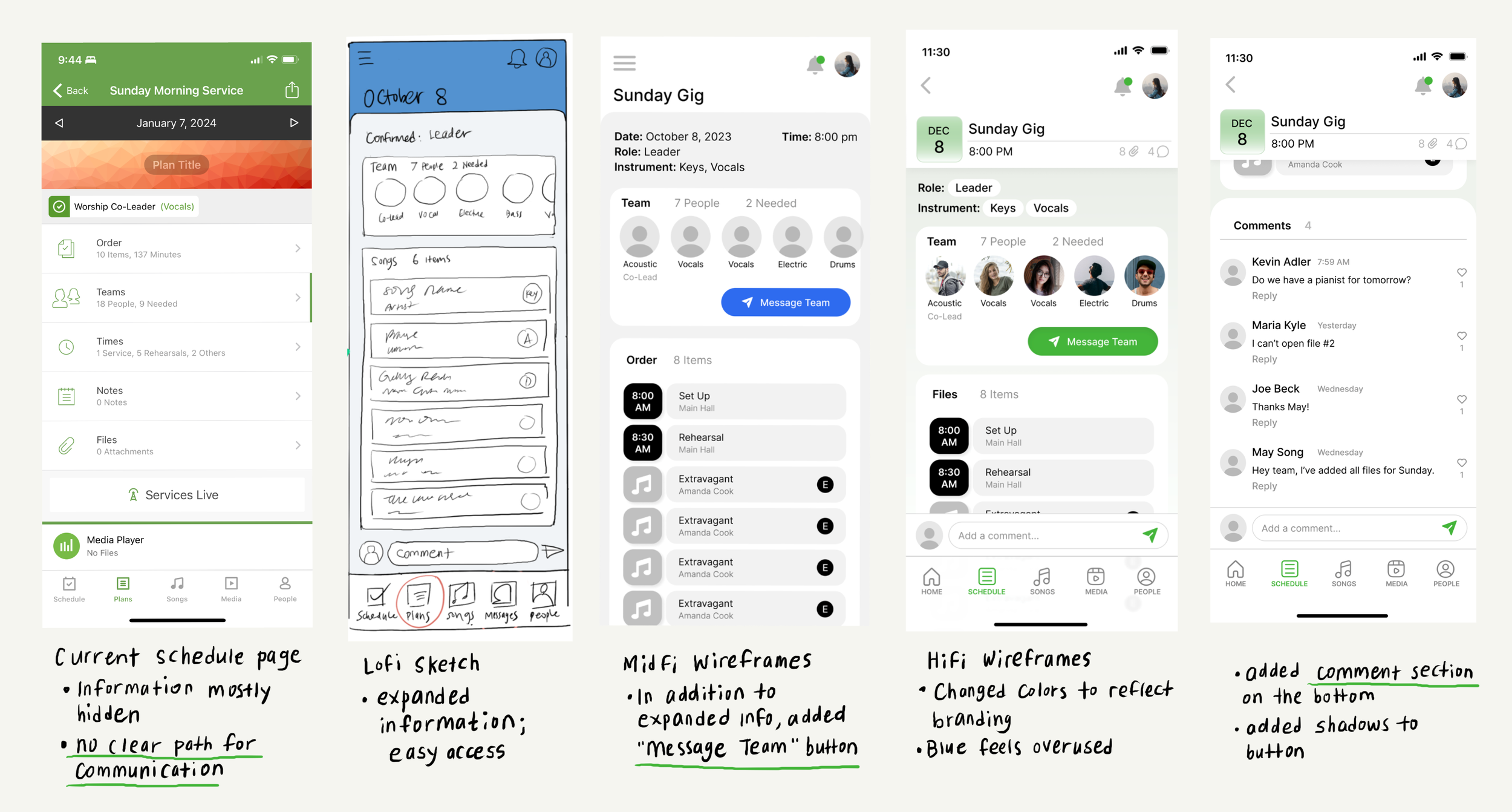
In these Low-Fidelity sketches, I outlined two methods of communication:
On the left is a built-in messaging feature, similar to texting.
The right side explores a comment section feature that allows users to comment directly on an event post, similar to Trello or even social media.
The Solution
Initially, a messaging feature felt like the most obvious choice when it came down to communication. However, after asking the users themselves, I discovered that they didn’t want another messaging app.
“We already have so many messaging apps,” they said.
Apart from text messaging, there are apps ranging from WhatsApp to Slack to Facebook Messenger, and even email. People did not want to have to check an inbox on yet another platform.
So I decided to expand on the comment section feature instead. The major benefit to this option would be that all posts on a comment section would be contained under a specific event and would keep communication organized.
The Process
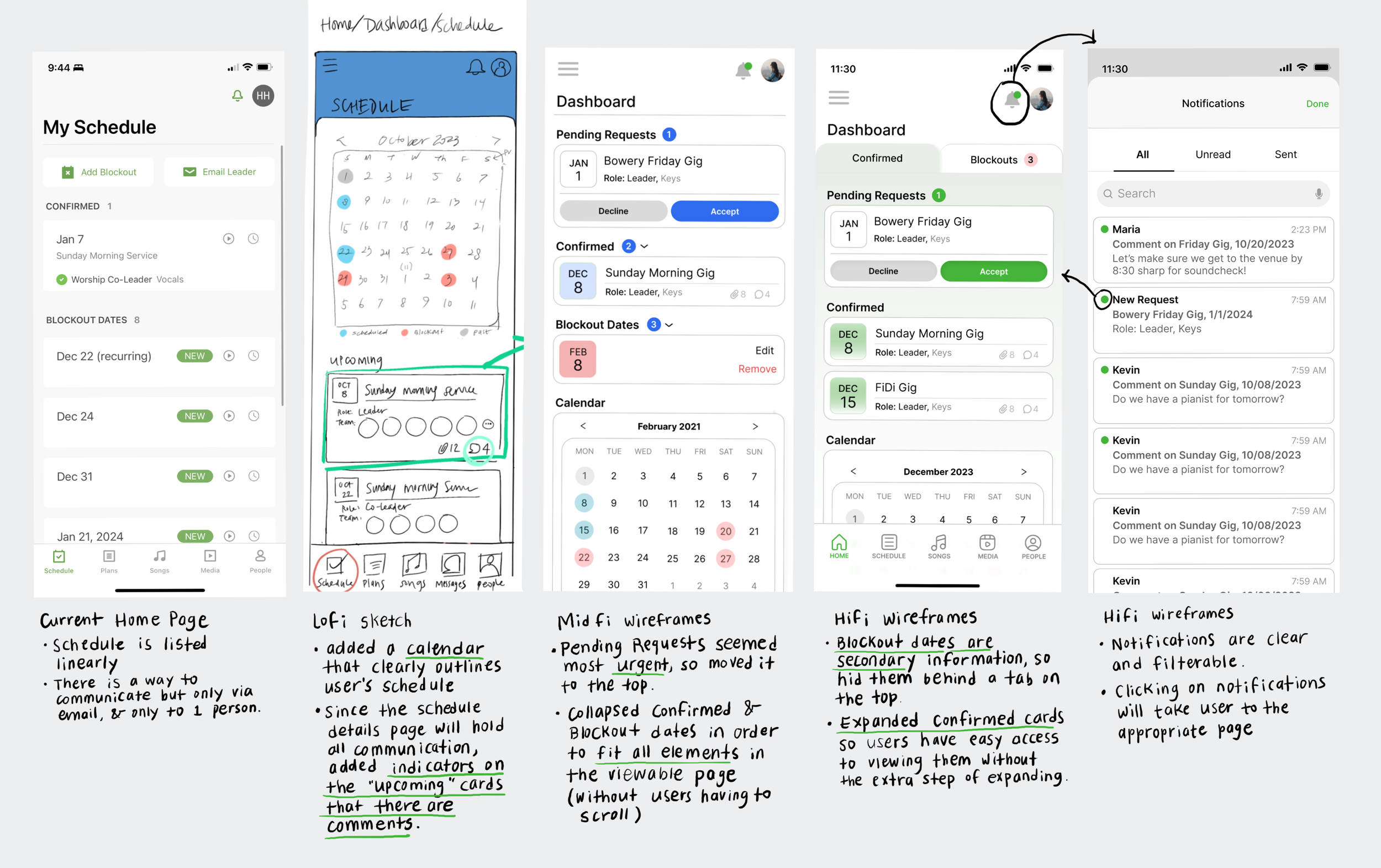
Here is an outline of my process of designing 2 different screens from low fidelity to high fidelity wireframes, and the thoughts that produced changes through each step.
This Gig page above is where most of the solution plays out.
The in-your-face “Message Team” button is the most obvious way to contact the whole team.
The “Add a comment” bar on the bottom follows the user as they scroll until they reach the comments section, where they can also communicate about the gig.
The home page above is streamlined to help visually organize the user’s schedule.
Not receiving notifications for updates or changes was one of the pain points during interviews, so that was a feature that was fleshed out.
Task Flow of Future State
After creating high-fidelity mockups, I organized them around a task flow of a user’s journey around the communication tools, starting from when they receive a notification on their lock page.
From there, they check comments, send messages, notice more notifications which influence them to take action.
Zoom-In View of the Comment Section
Prototyping
Usability Testing
Six participants provided feedback about the prototype.
Feedback from Users:
At first, the items in the Notifications overlay were unclickable. Users wanted to click them though because they were the elements that would take them to the next step in their journey.
The navigation bar icons did not turn green when users clicked on them, so users had a hard time identifying where they were in the information architecture.
Future Impact
I anticipate a steady increase in users not only because communication is easy, but because users can see that Planning Center is making changes around their needs.
When Planning Center eventually levels up communication tools to include a chat feature, this positive growth will only increase.
In the future, I expect Planning Center to become an app that not only musicians can utilize, but expand into other industries that plan events and schedules.


