


Increasing registration rates & decreasing frustrations in navigation.
School of Wonder provides unique social-emotional curricula and nature-based programs for children.
The Problem
New users were spending too much time navigating the website while trying to register for a program with over 65% of them never making it past the home page. This caused major drop-off rates and faltering numbers in registration.
Our Solution
Clear buttons were added in the homepage to give users a much more direct path to initiate the registration process.
The architecture and content of the website was also significantly restructured and simplified.
My Role
I was responsible for everything related to UX :
user interviews
user flows
wireframes
testing
The team consisted of a UX Designer, the CEO (the stakeholder), a Product Manager, and two Advisors.
The Design Process
-
Quantitative and qualitative interviews with 12 educators from diverse backgrounds
Affinity mapping to clarify user motivations and pain points
-
Determined pain points in current site map
Restructured site map to reflect solutions to pain points
-
Low/Mid/High fidelity wireframes for desktop and mobile
Iterating based on feedback
Prototypes
-
Conducted usability tests with 7 participants
Mapped out pain points
Iterated on areas based on user feedback
-
Worked with product team to create branding concepts based on company values and stories
Produced full design system with component library
Created hand drawn illustrations used throughout the website
-
Restructuring the information architecture and simplifying the content increased visits and engagement by over 110% during the month the new website was launched, and were sustained by at least 90% for the next 4 months.

The Problem
School of Wonder was initially seeking a way to elevate the overall branding of the site with the hopes of boosting sales. However, user interviews revealed that aesthetics was not the solution to increasing sales.
New users were either:
spending too much time registering for a program
giving up during the registration process as a result of frustration
“…around 65% of new users never made it past the home page.”
Research
New users struggled to find the program registration button, which led to frustration and loss of interest. They also found the site’s information scattered and hard to understand, making it difficult to grasp what School of Wonder was about.
Month-to-month user analytics revealed that around 65% of new users never made it past the home page.
Out of the average monthly 800-900 users visiting the website, only about 25 actually registered for programs.
Returning users preferred using the FAQ or emailing School of Wonder instead of navigating the website. They found the text too dense and often didn't read it.
Research Synthesis
The interviews and task flows revealed that the website’s lack of clear CTA buttons caused users to get lost. Users faced frustration as “sign-up” buttons led to “more info” buttons and then to “register” buttons. Additionally, information was often presented in long, confusing paragraphs.
Site Map of Current State
Drawing out the site map below helped illustrate user frustrations in the program registration process.
*The red circles indicate pain points.

Overall, the information architecture could be simplified. Users were often overwhelmed in the face of so much information being presented to them.
Here is a zoomed in portion of the site map above.

Task Flow of Current State
The task flow illustrates where the hiccups happen in the user journey to completing a program sign-up.
The red dots indicate the pain points and the Low Fidelity sketches were my initial thoughts on how things could be improved.

Major Hiccups
Lack of a CTA button, or any kind of indicator that leads users to register for a program.
It takes too many scrolls and clicks for the users to get from the homepage to the registration page.
Registration terminology is inconsistent. First it gets invites users to “Sign Up,” then is led to click a button that says “More Info,” which then has user click a “Register" button. Finally, the user is presented with either a log-in procedure or a form to fill, based on whether they are logged in or not.

Zoomed in shots of Task Flow Above
The Solution
Solutions we decided would help solve our problems were:
Add clear buttons in the homepage that initiates registration and leads users in the right direction.
Reduce the number of clicks it took to register for a program.

The Process to High Fidelity Wireframes

Current State
The homepage lacks a Call to Action button, which leads the user to either scroll around for it or try to find what they need by clicking through the navigation bar.

Lofi Solution Sketch
Emphasized the CTA buttons.

High Fidelity Wireframes
The CTA button is clear and visible. It's placed on the hero image so users can’t miss it.

Current State
Information about the program is written out in large paragraphs and also scattered illogically so users are unable to get a comprehensive understanding.
Lofi Solution Sketch
Organized the IA so programs are clearly laid out.

High Fidelity Wireframes
Condensed the text to make it more readable.
Gave users an option to learn more on a separate page if they are interested.

Current State
These two objects are programs. The link to more information is in the orange texts underneath the images, but users admitted that they didn’t know they were buttons.
Lofi Solution Sketch
Camps are a huge part of this program, so we gave it its own section.

High Fidelity Wireframes
Separated the two programs into 2 sections in tandem (This is the first section). Information is more digestible if presented one at a time. Also added buttons to lead users toward registration.

Current State
When the user clicks the “Register” button from the Program page, they’re taken to this page where they need to click another “Sign Up” button. This action scrolls the page down to the Calendar section at the bottom, skipping over important information in the middle.

Lofi Solutions
The Sign-up Calendar should be the first thing users encounter when users click on a program or a CTA button.

High Fidelity Wireframes
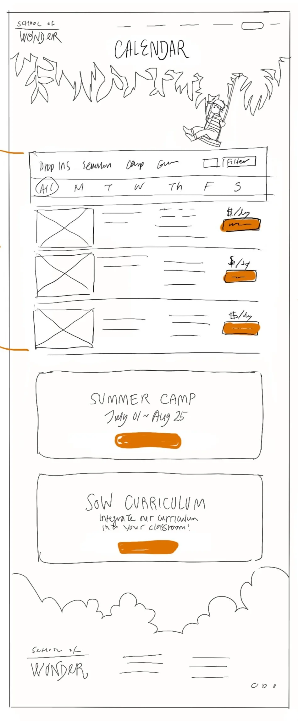
The Calendar was placed in a separate tab on the Nav menu.
The Calendar is also the first thing on the page, so users don’t have to scroll down.
This is helpful not only for new users, who don’t want to wander needlessly, but also for returning users, who just want to register quickly, with minimum scrolling.
For the navigation bar, I grouped relevant features together and simplified the menu so users know exactly what they're getting when they click on a feature.


School of Wonder 2.0
Usability testing showed that some text was still too wordy and the registration process was too lengthy, though much improved. While we can address the wordiness, simplifying the registration steps is limited since it’s handled by a third party. Thus, we are now prioritizing developing our own checkout system.
Key updates to the website include the introduction of prominent CTA buttons and a streamlined site map for improved navigation. Additionally, all information is now organized into distinct categories, each housed on dedicated pages for easier access and clarity.
Design System
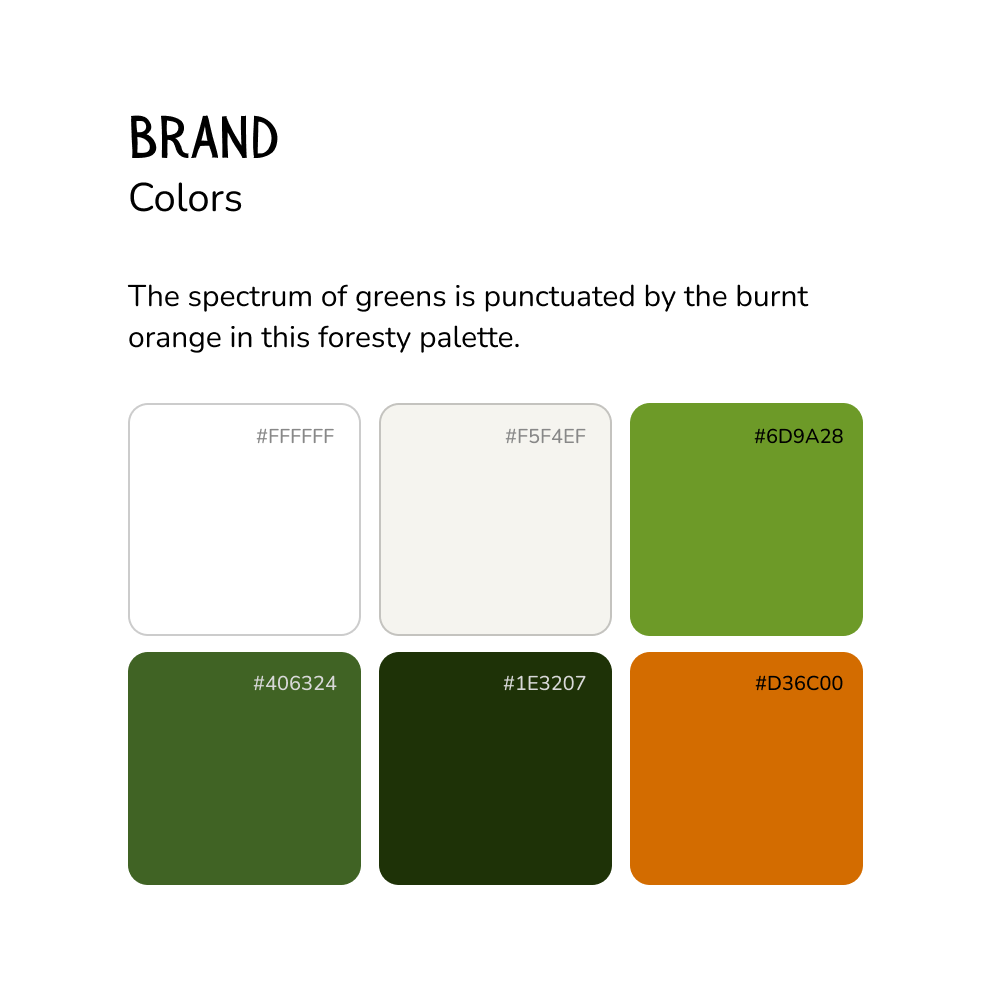

Orange emerged as the primary color because it created a striking contrast against the predominantly green backgrounds in the photos. The greens as secondary and tertiary colors were used in areas that made the orange hard to see.

Branding


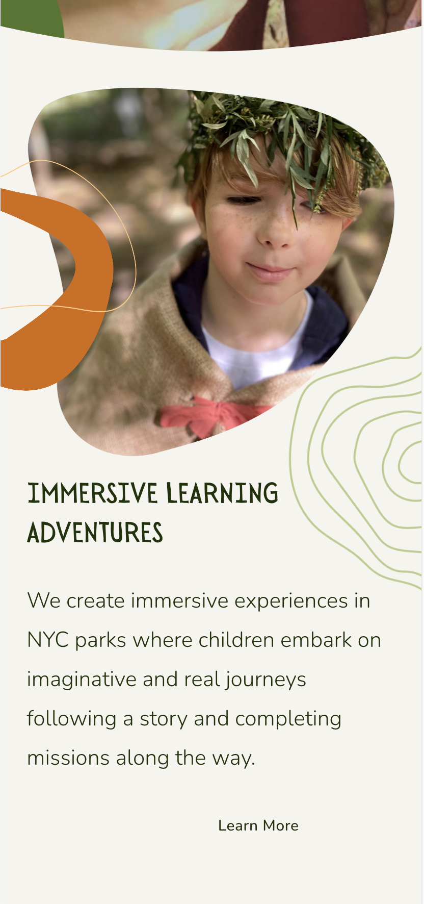
School of Wonder’s branding incorporates a lot of hand-drawn, whimsical elements. I developed most of the illustrations and visual language for their website and products:
Logos
Colors
Graphics
Font
Illustrations
Results

Visits to the website

Blue: Program Subscriptions
Green & Orange: 2 different Newsletter Sign-Ups
Restructuring the information architecture and simplifying content led to a 110% increase in website visits during the launch month, with a sustained 90% increase over the next four months. Program subscriptions and newsletter signups also surged, peaking during the launch.
We expect continued growth and sustained engagement as we further enhance the School of Wonder’s website.